Wednesday 11 February 2009

Neville Brody


  1. Neville Brody was born on the 23rd April in 1957 in London. Neville Brody is an English graphic design, art director and typographer. In 1980, Brody started designing for a magazine called “The Face”, and did his last design in 2004 because the magazine was no longer going to be on sale. In 1985, Brody did some re-designs for the logo CND (the peas sign). Neville Brody was using a variety of different lettering; he re-designed the alphabet. And continues to design different styles of lettering today. Brody has done poster designs and the structure of magazine articles. His work is very modern and up to date, I like his style because he makes the article interesting to read and it looks affective to the eye, e.g. bright colours and large fonts. Neville Brody is still producing affective work to this day.


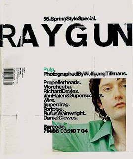
This is some of Neville Brody's work


This is a CD cover

It is a man tied up and blindfolded.


He's not used much colour but with it being black and white it looks really effective.

  • I like how he used the turquoise colour for the name of the song, because it draws your eye to it.

  • I like how Brody put the bands website page on the cover.


This is one of he own re-designed Albert's

It's bold.


It's got a funky look to it .


I like how he's shown us the style in capital letters and lower case litters.

Some of the letters remind me of cut outs for example the "E" and "F".


He's also shown us how this style would look in numbers and symbols .


This is a front cover of The Face magazine


It looks affective because of the colour's he has used, the peach/orange colour goes really well with the black and white.


I think that the title looks really affective because the "A" is an triangle.

I think what also makes this affective is that there's an image of a boy on the front cover and he looks to me the he is very serious.

There's not too much writing on the front, but where Brody has placed it text it blends in with the image.

Tuesday 10 February 2009

Saul Bass


Saul Bass was born in New York on 8th May 1920 and then died in 1996 at the age of 75. Bass was one of the greatest Graphic Designers of the 20th Century. Bass did graphical logos for all different companies such as Kleenex, AT&T, Quaker, and many more. Bass designed posters and he had his own style that when you looked at it that you just know that it was his work. What Bass use to do was that he would cut out every letter for every word that was going onto his poster by hand, because in those days there computers was not as advance as they are now. But as the years when on the computers got a lot more advance so that Bass could try and do more different styles of his work. As Bass was doing his posters he also started to do film titles for the big films that was coming out in the years. Bass did some really interesting but very simple titles for the films that now some of his work of his work is still being used today. Saul Bass is one of the most successful Graphic Designers in film posters, logos and film title that him and his work will still live on.


This is some of Saul Bass's work


This is a sort clip of one of his films that he had designed for


Saul Bass was the first graphic designer to ever do moving text for a film. This is one that Bass has done and it was a big hit.


This is one Film that Bass also designed for but he did a poster to go with it to


It's bold.


It's bright.


It stands out because of the colours.


Letters have been cut out by hand.


The contrast with the colours is very effective, because of the red background the black and white seem to stand out a lot bolder.


This is another poster for a different film that he designed


I think that this is really effective because it is hand cut and he has used a bit of technology for the people in the poster.

The way he has cut it out it is not straight so that makes it look a bit incomplete.

I like how the text has been placed and with the arm running through, it just makes you look at the poster in more detail.

The colours that he has used are very effective with the different shades of blue and a very heavy black.

The way he has placed the people in the poster is very good, because it makes your eye's move around the poster.

David Carson


David Carson was born in 1952 and is still working today. Carson is a graphic designer who is famous for designing front covers and in 1992, he started designing for an American magazine call “Ray Gun”. In the magazine, his work was very interesting. For one piece of his work, he used an out line of a man and writes an article in it, and it would look really effective and it would make you wont to read about what the article is really about. Carson also has done some work for Pepsi, Nike, and Levi. Carson has designed some posters, DVD covers and CD covers. He has been a really successful graphic design and is still producing more effective and successful work.


This is some of David Carson's work


This is issue 55 of the magazine Raygun


This cover is very spacious.
He's overlapped the writing over the picture.
Some of the words are overlapping each other so its a bit hard to read.


There's only the colour green, which draws your eye to it, but generally it is quite plain.


I like how he has made the issue number part of the title.


The title looks as though it has been scratched into.


This is a poster


I like how the text is overlapping the image, and how it looks like it is moving across the page.


This lighting in the picture, make it look more effective.


The colour that Carson has used is a really good choice because it gives it that much effect, and that much life that you have to look into it and see all of the detail in it.


This is an article from a magazine


It's bold.


It's bright.


The blue and red clash.


I like how the "hello" is big and bold and how it runs across the page.


I like how there's a picture on the left hand side and how that just clashes. It looks really good how a photo and graphic images combine together to give off an affect like it has.