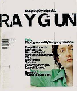
David Carson was born in 1952 and is still working today. Carson is a graphic designer who is famous for designing front covers and in 1992, he started designing for an American magazine call “Ray Gun”. In the magazine, his work was very interesting. For one piece of his work, he used an out line of a man and writes an article in it, and it would look really effective and it would make you wont to read about what the article is really about. Carson also has done some work for Pepsi, Nike, and Levi. Carson has designed some posters, DVD covers and CD covers. He has been a really successful graphic design and is still producing more effective and successful work.
This is some of David Carson's work
This is issue 55 of the magazine Raygun
This cover is very spacious.
He's overlapped the writing over the picture.
Some of the words are overlapping each other so its a bit hard to read.
There's only the colour green, which draws your eye to it, but generally it is quite plain.
I like how he has made the issue number part of the title.
The title looks as though it has been scratched into.
This is a poster
I like how the text is overlapping the image, and how it looks like it is moving across the page.
This lighting in the picture, make it look more effective.
The colour that Carson has used is a really good choice because it gives it that much effect, and that much life that you have to look into it and see all of the detail in it.
This is an article from a magazine

It's bold.
It's bright.
The blue and red clash.
I like how the "hello" is big and bold and how it runs across the page.
I like how there's a picture on the left hand side and how that just clashes. It looks really good how a photo and graphic images combine together to give off an affect like it has.


No comments:
Post a Comment